In this project, I use machine learning models for a classification task to solve another business problem for ABC Grocery: Logistic Regression, Decision Tree, Random Forest, and K-Nearest-Neighbors.
Table of contents
- 00. Project Overview
- 01. Data Overview
- 02. Modelling Overview
- 03. Logistic Regression
- 04. Decision Tree
- 05. Random Forest
- 06. KNN
- 07. Modelling Summary
- 08. Application
- 09. Growth & Next Steps
Project Overview
Context
ABC Grocery sent out mailers in a marketing campaign for their new delivery club. The dlub costs customers $100 per year for membership, and offered free grocery deliveries, rather than the normal cost of $10 per delivery. ABC hopes that this will encourage customers to buy more groceries, but the marketing campaign is expensive, so first they would like to know which customers are likely to sign up. This will allow ABC to be more targeted in their mailing, thus lowering costs and improving their return on investment.
Actions
The overall goal here is to predict delivery club membership, which is a binary (yes/no) outcome, and therefore a classification problem that machine learning can help solve.
Like the regression problem from a previous post (c.f., Predicting Customer Loyalty) this task involves familiar modeling techniques - Logistic (not linear) Regression, Decision Tree, and Random Forest - and here we include the K-Nearest Neighbors (KNN) method, and comparing the results for their predictive power. Because the methods are mostly familiar, I’ll reserve my notes for classification concerns.
The data from the last marketing campaign found that 69% of customers did not sign up and 31% did. The data is not perfectly balanced at 50:50, but it isn’t too imbalanced either. Thus, the data is appropriate for classification modeling, but we make sure to not rely on classification accuracy alone when assessing results - also analysing Precision, Recall, and F1-Score.
For each model below:
- Logistic Regression
- Decision Tree
- Random Forest
- K Nearest Neighbors
Data will be imported in the same way but will be pre-processed based on the requirements of each particular algorithm. I train & test each model, then look to refine each to provide optimal performance, and then measure this predictive performance based on several metrics to give a well-rounded overview of which is best.
Results
Again, like in the regression task, the Random Forest model here proves the best method for this particular data. It returns the highest classication accuracy, precision, recall, and f1-scores, and its the feature importance and permutation importance metrics allows the client an understanding of the key drivers behind delivery club signups.
Metric 1: Classification Accuracy
- KNN = 0.936
- Random Forest = 0.935
- Decision Tree = 0.929
- Logistic Regression = 0.866
Metric 2: Precision
- KNN = 1.00
- Random Forest = 0.887
- Decision Tree = 0.885
- Logistic Regression = 0.784
Metric 3: Recall
- Random Forest = 0.904
- Decision Tree = 0.885
- KNN = 0.762
- Logistic Regression = 0.69
Metric 4: F1 Score
- Random Forest = 0.895
- Decision Tree = 0.885
- KNN = 0.865
- Logistic Regression = 0.734
Growth/Next Steps
The model here performs well, and while we could look to other classification methods to try to improve predictive power, more value may be attained by learning from the key drivers of prediction. Not surprisingly, the strongest predictor of delivery club signup was how close the customer lives to the store. As this was the same variable that showed the strongest relationship to customer loyalty, it may make sense to collect more data on the geographic details of the business, specifically, where do customers live in relation to ABC vs. other stores?
___
Data Overview
The dependent variable here is the signup_flag metric from the campaign_data table in the client database.
The key variables hypothesized to predict this will come from the client database, namely the transactions table, the customer_details table, and the product_areas table.
After pre-processing and aggregating data from these tables in Python, the dataset for modelling contains the following fields…
| Variable Name | Variable Type | Description |
|---|---|---|
| signup_flag | Dependent | A binary variable showing if the customer signed up for the delivery club in the last campaign |
| distance_from_store | Independent | The distance in miles from the customers home address, and the store |
| gender | Independent | The gender provided by the customer |
| credit_score | Independent | The customers most recent credit score |
| total_sales | Independent | Total spend by the customer in ABC Grocery - 3 months pre campaign |
| total_items | Independent | Total products purchased by the customer in ABC Grocery - 3 months pre campaign |
| transaction_count | Independent | Total unique transactions made by the customer in ABC Grocery - 3 months pre campaign |
| product_area_count | Independent | The number of product areas within ABC Grocery the customers has shopped into - 3 months pre campaign |
| average_basket_value | Independent | The average spend per transaction for the customer in ABC Grocery - 3 months pre campaign |
Modelling Overview
We will build a model that looks to accurately predict signup_flag, based upon the customer metrics listed above.
If that can be achieved, we can use this model to predict signup & signup probability for future campaigns. This information can be used to target those more likely to sign-up, reducing marketing costs and thus increasing ROI.
As we are predicting a binary output, we tested three classification modelling approaches, namely:
- Logistic Regression
- Decision Tree
- Random Forest
- KNN
Logistic Regression
The code sections below are broken up into 5 key sections:
- Data Import
- Data Preprocessing
- Model Training
- Performance Assessment
- Optimal Threshold Analysis
Data Import
# import required packages
import pandas as pd
import pickle
import matplotlib.pyplot as plt
import numpy as np
from sklearn.linear_model import LogisticRegression
from sklearn.utils import shuffle
from sklearn.model_selection import train_test_split, cross_val_score, KFold
from sklearn.metrics import confusion_matrix, accuracy_score, precision_score, recall_score, f1_score
from sklearn.preprocessing import OneHotEncoder
from sklearn.feature_selection import RFECV

# import modelling data
data_for_model = pickle.load(open("data/delivery_club_modelling.p", "rb"))

# drop uneccessary columns
data_for_model.drop("customer_id", axis = 1, inplace = True)

# shuffle data
data_for_model = shuffle(data_for_model, random_state = 42)

# assess class balance of dependent variable
data_for_model["signup_flag"].value_counts(normalize = True)
Although the data isn’t perfectly balanced at 50:50, it isn’t imbalanced either. Instead of reling on classification accuracy alone when assessing results - we’ll also analyze Precision, Recall, and F1-Score - metrics that help us make sense of unbalanced data.
Data Preprocessing
Concerns for preprocessing Logistic Regression data include:
- Missing values in the data
- The effect of outliers
- Encoding categorical variables to numeric form
- Multicollinearity & Feature Selection
Missing Values
The number of missing values in the data was extremely low, so instead of applying any imputation (i.e. mean, most common value) we will just remove those rows
# remove rows where values are missing
data_for_model.isna().sum()
data_for_model.dropna(how = "any", inplace = True)
Outliers
The .describe() function from Pandas shows the spread of values for each of our predictors.
| metric | distance_from_store | credit_score | total_sales | total_items | transaction_count | product_area_count | average_basket_value |
|---|---|---|---|---|---|---|---|
| mean | 2.61 | 0.60 | 968.17 | 143.88 | 22.21 | 4.18 | 38.03 |
| std | 14.40 | 0.10 | 1073.65 | 125.34 | 11.72 | 0.92 | 24.24 |
| min | 0.00 | 0.26 | 2.09 | 1.00 | 1.00 | 1.00 | 2.09 |
| 25% | 0.73 | 0.53 | 383.94 | 77.00 | 16.00 | 4.00 | 21.73 |
| 50% | 1.64 | 0.59 | 691.64 | 123.00 | 23.00 | 4.00 | 31.07 |
| 75% | 2.92 | 0.67 | 1121.53 | 170.50 | 28.00 | 5.00 | 46.43 |
| max | 400.97 | 0.88 | 7372.06 | 910.00 | 75.00 | 5.00 | 141.05 |
As the max column values for several variables are much higher than the median value (e.g., in distance_from_store, total_sales, and total_items), we can consider removing outliers to help model generalize across the full dataset.
In real world terms, we can imagine that a customer that lives 400 miles from the store is not a regular customer, and someone that we wouldn’t imagine signing up for a delivery club. In data terms, we don’t want this person’s data influencing how the model is thinking about regular customers.
I use the “boxplot approach” where we remove any rows where the values within those columns are outside of the interquartile range multiplied by 2. In terms of distance_from_store, the 75th percentile + 2x is only 9 miles away. Because the vast majority of customers live within 9 miles (75% live within 3 miles), we’ll eliminate those that live further from the model. We continue this process for each of the variables where there are clear outliers.
outlier_investigation = data_for_model.describe()
outlier_columns = ["distance_from_store", "total_sales", "total_items"]

# boxplot approach
for column in outlier_columns:

    lower_quartile = data_for_model[column].quantile(0.25)
    upper_quartile = data_for_model[column].quantile(0.75)
    iqr = upper_quartile - lower_quartile
    iqr_extended = iqr * 2
    min_border = lower_quartile - iqr_extended
    max_border = upper_quartile + iqr_extended

    outliers = data_for_model[(data_for_model[column] < min_border) | (data_for_model[column] > max_border)].index
    print(f"{len(outliers)} outliers detected in column {column}")

    data_for_model.drop(outliers, inplace = True)
Split Out Data For Modelling
For classification modeling tasks, the data are split into training and test sets (as in regression analysis), and they are also stratified to ensure that both training and test sets have the same proportion of customers who did, and did not, sign up for the delivery club.
# split data into X and y objects for modelling
X = data_for_model.drop(["signup_flag"], axis = 1)
y = data_for_model["signup_flag"]

# split out training & test sets
X_train, X_test, y_train, y_test = train_test_split(X, y, test_size = 0.2, random_state = 42, stratify = y)
Categorical Predictor Variables
Recoding categorical data for classification works the same as it does for regression: data needs to be in numeric form, 1s and 0s.
Again, I use the One Hot Encoder function from scikitlearn to make the transformation. This ensures that the model can learn from patterns in the training data and apply them to unseen future data. For example, in the case of our data, although gender only includes two values, “M” & “F”, future data may include additional categories, and the code here allows the model the flexibility to parse the data in that event.
# list of categorical variables that need encoding
categorical_vars = ["gender"]

# instantiate OHE class
one_hot_encoder = OneHotEncoder(sparse=False, drop = "first")

# apply OHE
X_train_encoded = one_hot_encoder.fit_transform(X_train[categorical_vars])
X_test_encoded = one_hot_encoder.transform(X_test[categorical_vars])

# extract feature names for encoded columns
encoder_feature_names = one_hot_encoder.get_feature_names_out(categorical_vars)

# turn objects back to pandas dataframe
X_train_encoded = pd.DataFrame(X_train_encoded, columns = encoder_feature_names)
X_train = pd.concat([X_train.reset_index(drop=True), X_train_encoded.reset_index(drop=True)], axis = 1)
X_train.drop(categorical_vars, axis = 1, inplace = True)

X_test_encoded = pd.DataFrame(X_test_encoded, columns = encoder_feature_names)
X_test = pd.concat([X_test.reset_index(drop=True), X_test_encoded.reset_index(drop=True)], axis = 1)
X_test.drop(categorical_vars, axis = 1, inplace = True)
Feature Selection
Features Selection also works the same for logistic regression as it does for linear regression. Selecting the most important variables for the model means that we can have:
- Improved Model Accuracy - eliminating noise can help true relationships stand out
- Lower Computational Cost - our model becomes faster to train, and faster to make predictions
- Explainability - understanding & explaining outputs for stakeholder & customers becomes much easier
Although I like to analyze variable relationships at the bivariate level - using Chi-Square analyses to assess relationships (with categorical outcomes), Recursive Feature Elimination With Cross Validation using the scikitlearn package is convenient for machine learning tasks. RFECV splits the data into many “chunks” and iteratively trains & validates models on each “chunk” seperately. This means that each time we assess different models with different variables included, or eliminated, the algorithm also knows how accurate each of those models was. From the suite of model scenarios that are created, the algorithm can determine which provided the best accuracy, and thus can infer the best set of input variables to use!
# instantiate RFECV & the model type to be utilised
clf = LogisticRegression(random_state = 42, max_iter = 1000)
feature_selector = RFECV(clf)

# fit RFECV onto our training & test data
fit = feature_selector.fit(X_train,y_train)

# extract & print the optimal number of features
optimal_feature_count = feature_selector.n_features_
print(f"Optimal number of features: {optimal_feature_count}")

# limit our training & test sets to only include the selected variables
X_train = X_train.loc[:, feature_selector.get_support()]
X_test = X_test.loc[:, feature_selector.get_support()]
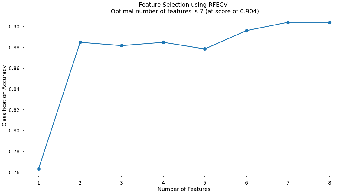
The below code then produces a plot that visualises the cross-validated classification accuracy with each potential number of features.
plt.style.use("seaborn-v0_8-poster")
plt.plot(range(1, len(fit.cv_results_['mean_test_score']) + 1), fit.cv_results_['mean_test_score'], marker = "o")
plt.ylabel("Classification Accuracy")
plt.xlabel("Number of Features")
plt.title(f"Feature Selection using RFECV \n Optimal number of features is {optimal_feature_count} (at score of {round(max(fit.cv_results_['mean_test_score']),4)})")
plt.tight_layout()
plt.show()
The highest cross-validated classification accuracy (0.904) is when we include seven of our original input variables.
Model Training
Now can train the model, using the random_state parameter to ensure reproducible results. The max_iter = 1000 parameter to allow the solver more attempts at finding an optimal regression line, as the default value of 100 was not enough.
# instantiate our model object
clf = LogisticRegression(random_state = 42, max_iter = 1000)

# fit our model using our training & test sets
clf.fit(X_train, y_train)
Model Performance Assessment
Predict On The Test Set
To assess how well our model is predicting on new data - we ask the trained model object (here called clf) to predict the signup_flag variable for the test set.
In the code below we create one object to hold the binary 1/0 predictions, and another to hold the actual prediction probabilities for the positive class.
# predict on the test set
y_pred_class = clf.predict(X_test)
y_pred_prob = clf.predict_proba(X_test)[:,1]
Confusion Matrix
A Confusion Matrix provides us a visual way to understand how our predictions match up against the actual values for those test set observations.
The below code creates the Confusion Matrix using the confusion_matrix functionality from within scikit-learn and then plots it using matplotlib.
# create the confusion matrix
conf_matrix = confusion_matrix(y_test, y_pred_class)

# plot the confusion matrix
plt.style.use("seaborn-v0_8-poster")
plt.matshow(conf_matrix, cmap = "coolwarm")
plt.gca().xaxis.tick_bottom()
plt.title("Confusion Matrix")
plt.ylabel("Actual Class")
plt.xlabel("Predicted Class")
for (i, j), corr_value in np.ndenumerate(conf_matrix):
    plt.text(j, i, corr_value, ha = "center", va = "center", fontsize = 20)
plt.show()
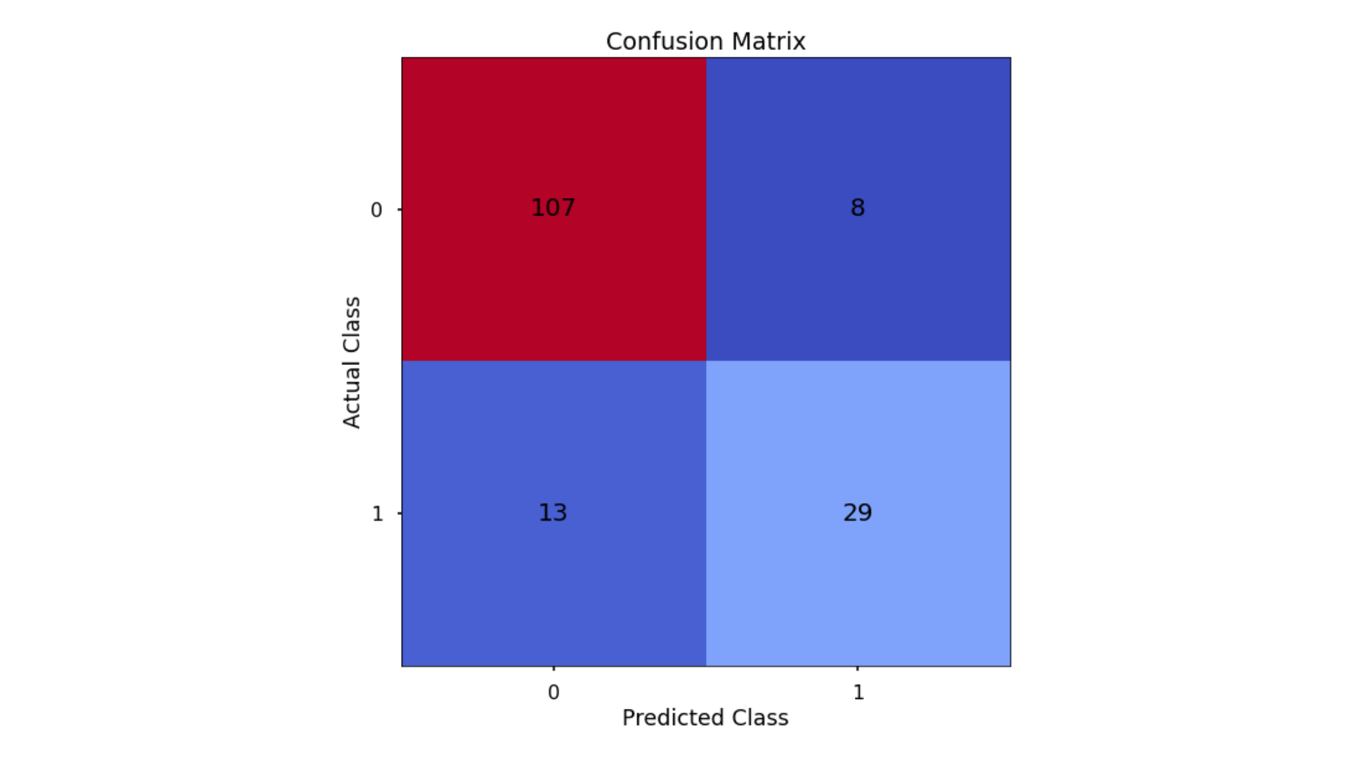
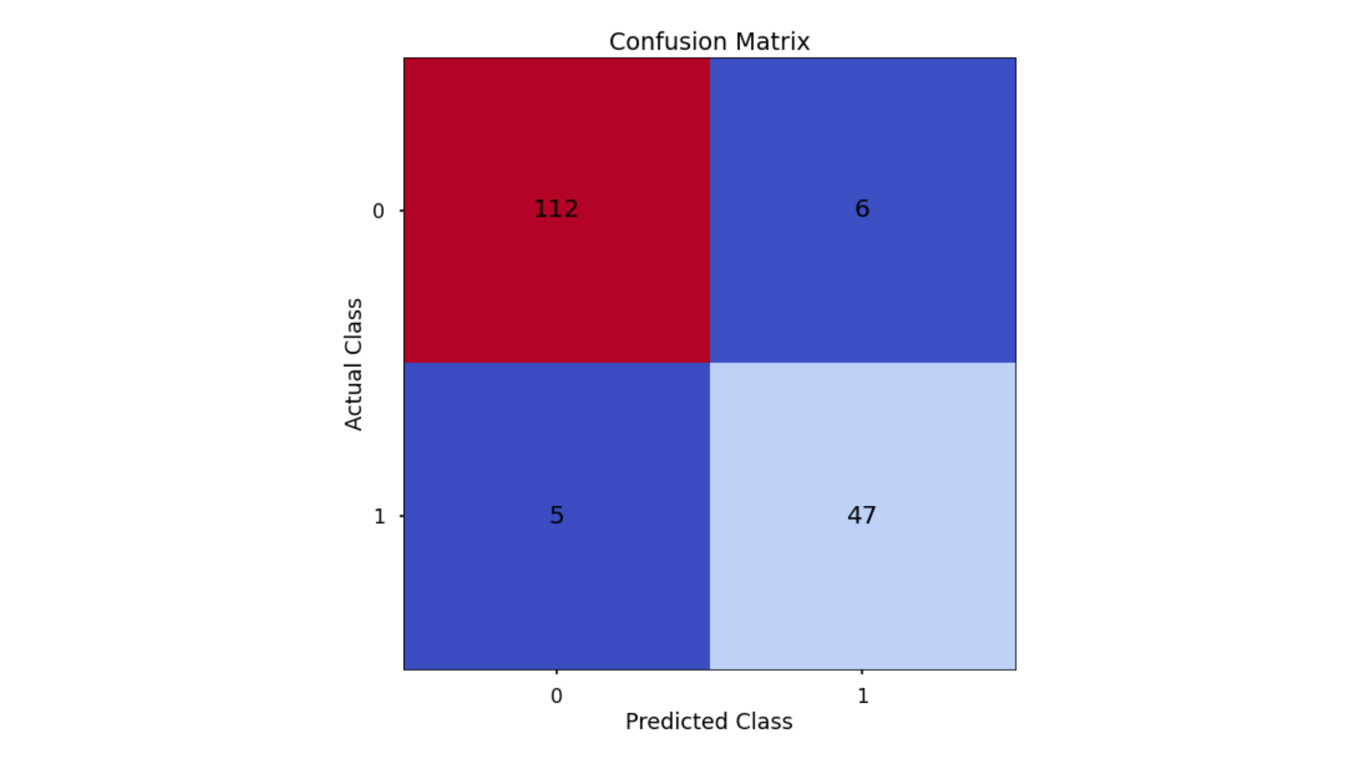
The aim is to have a high proportion of observations falling into the top left cell (predicted non-signup and actual non-signup) and the bottom right cell (predicted signup and actual signup).
Since the proportion of signups in our data was around 30:70 we will next analyse not only Classification Accuracy, but also Precision, Recall, and F1-Score which will help us assess how well our model has performed in reality.
Classification Performance Metrics
Classification Accuracy
Classification Accuracy is a metric that tells us of all predicted observations, what proportion were correctly classified. This is intuitive, but when dealing with imbalanced classes, classification accuracy alone can be misleading.
An example of this could be a rare disease. A model with a 98% Classification Accuracy on might appear like a fantastic result, but if our data contained 98% of patients without the disease, and 2% with the disease - then a 98% Classification Accuracy could be obtained simply by predicting that no one has the disease - even though the model did nothing.
Precision & Recall
Precision is a metric that tells us of all observations that were predicted as positive, how many actually were positive
Keeping with the rare disease example, Precision would tell us of all patients we predicted to have the disease, how many actually did
Recall is a metric that tells us of all positive observations, how many did we predict as positive
Again, referring to the rare disease example, Recall would tell us of all patients who actually had the disease, how many did we correctly predict
The tricky thing about Precision & Recall is that it is impossible to optimize both. If you try to increase Precision, Recall decreases, and vice versa. Sometimes however it will make more sense to try and elevate one of them, in spite of the other. In the case of rare-disease prediction, perhaps it would be more important to optimize for Recall as we want to classify as many positive cases as possible. In saying this however, we don’t want to just classify every patient as having the disease, as that isn’t a great outcome either!
F1 Score
So… the F1-Score is a metric that takes the harmonic mean of Precisoin and Recall. A good, or high, F1-Score comes when there is a balance between Precision & Recall, rather than a disparity between them. It means that the model is working well for both positive & negative classifications rather than skewed towards one or the other. To return to the rare disease predictions, a high F1-Score would mean there is a good balance between successfully predicting the disease when it’s present, and not predicting cases where it’s not present.
And again, the scikitlearn package makes calculating all of this very convenient.
# classification accuracy
accuracy_score(y_test, y_pred_class)

# precision
precision_score(y_test, y_pred_class)

# recall
recall_score(y_test, y_pred_class)

# f1-score
f1_score(y_test, y_pred_class)
Running this code gives us:
- Classification Accuracy = 0.866 meaning we correctly predicted the class of 86.6% of test set observations
- Precision = 0.784 meaning that for our predicted delivery club signups, we were correct 78.4% of the time
- Recall = 0.69 meaning that of all actual delivery club signups, we predicted correctly 69% of the time
- F1-Score = 0.734
Since our data is somewhat imbalanced, looking at these metrics is a good idea, and gives us a much better understanding of what our predictions mean. The same metrics can be applied to the other classification models for this task, so we can compare them to find out what type of algorithm works the best.
Finding The Optimal Classification Threshold
By default, most pre-built classification models & algorithms will just use a 50% probability to discern between a positive class prediction (delivery club signup) and a negative class prediction (delivery club non-signup).
Just because 50% is the default threshold does not mean it is the best one for our task. A lower or higher probability threshold (although counterintuitive) may actually predict the data better.
Different thresholds can be used, and the accuracy metrics can be plotted, to find the optimal solution threshold.
# set up the list of thresholds to loop through
thresholds = np.arange(0, 1, 0.01)

# create empty lists to append the results to
precision_scores = []
recall_scores = []
f1_scores = []

# loop through each threshold - fit the model - append the results
for threshold in thresholds:

    pred_class = (y_pred_prob >= threshold) * 1

    precision = precision_score(y_test, pred_class, zero_division = 0)
    precision_scores.append(precision)

    recall = recall_score(y_test, pred_class)
    recall_scores.append(recall)

    f1 = f1_score(y_test, pred_class)
    f1_scores.append(f1)

# extract the optimal f1-score (and it's index)
max_f1 = max(f1_scores)
max_f1_idx = f1_scores.index(max_f1)
Now we have run this, we can use the below code to plot the results!
# plot the results
plt.style.use("seaborn-v0_8-poster")
plt.plot(thresholds, precision_scores, label = "Precision", linestyle = "--")
plt.plot(thresholds, recall_scores, label = "Recall", linestyle = "--")
plt.plot(thresholds, f1_scores, label = "F1", linewidth = 5)
plt.title(f"Finding the Optimal Threshold for Classification Model \n Max F1: {round(max_f1,2)} (Threshold = {round(thresholds[max_f1_idx],2)})")
plt.xlabel("Threshold")
plt.ylabel("Assessment Score")
plt.legend(loc = "lower left")
plt.tight_layout()
plt.show()
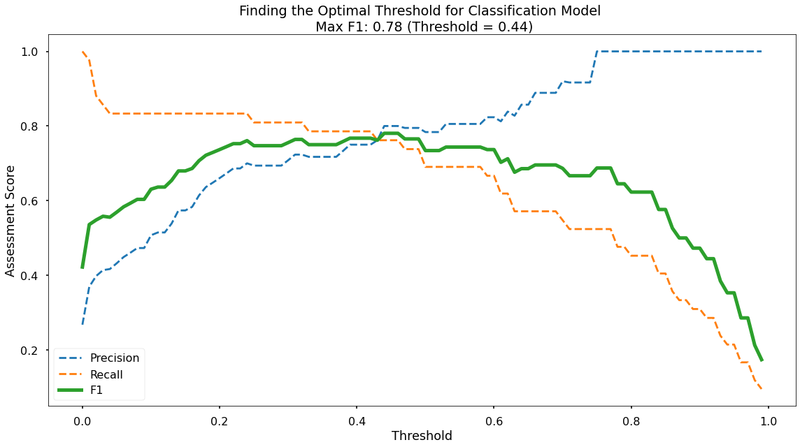
Thus we can visualize our performance metrics at each 0.01 probability treshhold between 0 and 1. As per the legend, we have Precision as a blue dotted line, Recall as an orange dotted line, and F1-Score as a thick green line. As we can see, the point where Precision & Recall meet is where the F1-Score is maximized, which is obtained at a classification threshold of 0.44.
Decision Tree
Data Import
# import required packages
import pandas as pd
import pickle
import matplotlib.pyplot as plt
import numpy as np
from sklearn.tree import DecisionTreeClassifier, plot_tree
from sklearn.utils import shuffle
from sklearn.model_selection import train_test_split, cross_val_score, KFold
from sklearn.metrics import confusion_matrix, accuracy_score, precision_score, recall_score, f1_score
from sklearn.preprocessing import OneHotEncoder

# import modelling data
data_for_model = pickle.load(open("data/delivery_club_modelling.p", "rb"))

# drop uneccessary columns
data_for_model.drop("customer_id", axis = 1, inplace = True)

# shuffle data
data_for_model = shuffle(data_for_model, random_state = 42)

# assess class balance of dependent variable
data_for_model["signup_flag"].value_counts(normalize = True)
Data Preprocessing
While Logistic Regression is susceptible to the effects of outliers, and highly correlated input variables - Decision Trees are not, so we don’t need to remove them.
Missing Values
# remove rows where values are missing
data_for_model.isna().sum()
data_for_model.dropna(how = "any", inplace = True)
Split Out Data For Modelling
Again, we make sure to add in the stratify parameter to ensure that both our training and test sets have the same proportion of customers who did, and did not, sign up for the delivery club - so we can be more confident in our assessment of predictive performance.
# split data into X and y objects for modelling
X = data_for_model.drop(["signup_flag"], axis = 1)
y = data_for_model["signup_flag"]

# split out training & test sets
X_train, X_test, y_train, y_test = train_test_split(X, y, test_size = 0.2, random_state = 42, stratify = y)
Categorical Predictor Variables
c.f., Logistic Regression, above.
# list of categorical variables that need encoding
categorical_vars = ["gender"]

# instantiate OHE class
one_hot_encoder = OneHotEncoder(sparse=False, drop = "first")

# apply OHE
X_train_encoded = one_hot_encoder.fit_transform(X_train[categorical_vars])
X_test_encoded = one_hot_encoder.transform(X_test[categorical_vars])

# extract feature names for encoded columns
encoder_feature_names = one_hot_encoder.get_feature_names_out(categorical_vars)

# turn objects back to pandas dataframe
X_train_encoded = pd.DataFrame(X_train_encoded, columns = encoder_feature_names)
X_train = pd.concat([X_train.reset_index(drop=True), X_train_encoded.reset_index(drop=True)], axis = 1)
X_train.drop(categorical_vars, axis = 1, inplace = True)

X_test_encoded = pd.DataFrame(X_test_encoded, columns = encoder_feature_names)
X_test = pd.concat([X_test.reset_index(drop=True), X_test_encoded.reset_index(drop=True)], axis = 1)
X_test.drop(categorical_vars, axis = 1, inplace = True)
Model Training
# instantiate our model object
clf = DecisionTreeClassifier(random_state = 42, max_depth = 5)

# fit our model using our training & test sets
clf.fit(X_train, y_train)
Model Performance Assessment
Predict On The Test Set
Just like we did with Logistic Regression, to assess how well our model is predicting on new data - we use the trained model object (here called clf) and ask it to predict the signup_flag variable for the test set.
In the code below we create one object to hold the binary 1/0 predictions, and another to hold the actual prediction probabilities for the positive class.
# predict on the test set
y_pred_class = clf.predict(X_test)
y_pred_prob = clf.predict_proba(X_test)[:,1]
Confusion Matrix
# create the confusion matrix
conf_matrix = confusion_matrix(y_test, y_pred_class)

# plot the confusion matrix
plt.style.use("seaborn-v0_8-poster")
plt.matshow(conf_matrix, cmap = "coolwarm")
plt.gca().xaxis.tick_bottom()
plt.title("Confusion Matrix")
plt.ylabel("Actual Class")
plt.xlabel("Predicted Class")
for (i, j), corr_value in np.ndenumerate(conf_matrix):
    plt.text(j, i, corr_value, ha = "center", va = "center", fontsize = 20)
plt.show()

Classification Performance Metrics
Accuracy, Precision, Recall, F1-Score
For details on these performance metrics, please see the above section on Logistic Regression.
# classification accuracy
accuracy_score(y_test, y_pred_class)

# precision
precision_score(y_test, y_pred_class)

# recall
recall_score(y_test, y_pred_class)

# f1-score
f1_score(y_test, y_pred_class)
- Classification Accuracy = 0.929 meaning we correctly predicted the class of 92.9% of test set observations
- Precision = 0.885 meaning that for our predicted delivery club signups, we were correct 88.5% of the time
- Recall = 0.885 meaning that of all actual delivery club signups, we predicted correctly 88.5% of the time
- F1-Score = 0.885
These are all higher than what we saw when applying Logistic Regression, even after we had optimized the classification threshold!
Visualise Our Decision Tree
To see the decisions that have been made in the tree, we can use the plot_tree functionality that we imported from scikit-learn.
# plot the nodes of the decision tree
plt.figure(figsize=(25,15))
tree = plot_tree(clf,
                 feature_names = X.columns,
                 filled = True,
                 rounded = True,
                 fontsize = 16)
That code gives us the below plot:
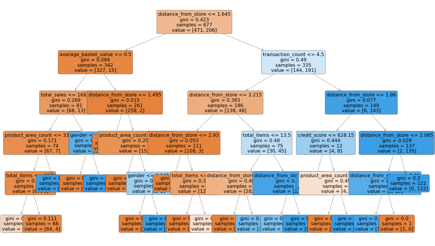
We can note that the very first split appears to be using the variable distance from store so it would seem that this is a very important variable when it comes to predicting signups to the delivery club.
Decision Tree Regularisation
Decision Trees will over-fit if they’re not limited in some way. Without any limits on their splitting, they will end up learning the training data perfectly. Instead we want a model that is flexible and can generalize, instead of predicting data that it already knows, as this will be more robust & reliable when making predictions on new data.
Like with the regression analysis (c.f., predicting customer loyalty), we can apply a max_depth parameter. We initially trained our model with a placeholder depth of 5, but we don’t know the number for this until we loop over a variety of values and assess which gives us the best predictive performance.
# finding the best max_depth

# set up range for search, and empty list to append accuracy scores to
max_depth_list = list(range(1,15))
accuracy_scores = []

# loop through each possible depth, train and validate model, append test set f1-score
for depth in max_depth_list:

    clf = DecisionTreeClassifier(max_depth = depth, random_state = 42)
    clf.fit(X_train,y_train)
    y_pred = clf.predict(X_test)
    accuracy = f1_score(y_test,y_pred)
    accuracy_scores.append(accuracy)

# store max accuracy, and optimal depth
max_accuracy = max(accuracy_scores)
max_accuracy_idx = accuracy_scores.index(max_accuracy)
optimal_depth = max_depth_list[max_accuracy_idx]
… which we can vizualize with the following.
# plot accuracy by max depth
plt.plot(max_depth_list,accuracy_scores)
plt.scatter(optimal_depth, max_accuracy, marker = "x", color = "red")
plt.title(f"Accuracy (F1 Score) by Max Depth \n Optimal Tree Depth: {optimal_depth} (F1 Score: {round(max_accuracy,4)})")
plt.xlabel("Max Depth of Decision Tree")
plt.ylabel("Accuracy (F1 Score)")
plt.tight_layout()
plt.show()
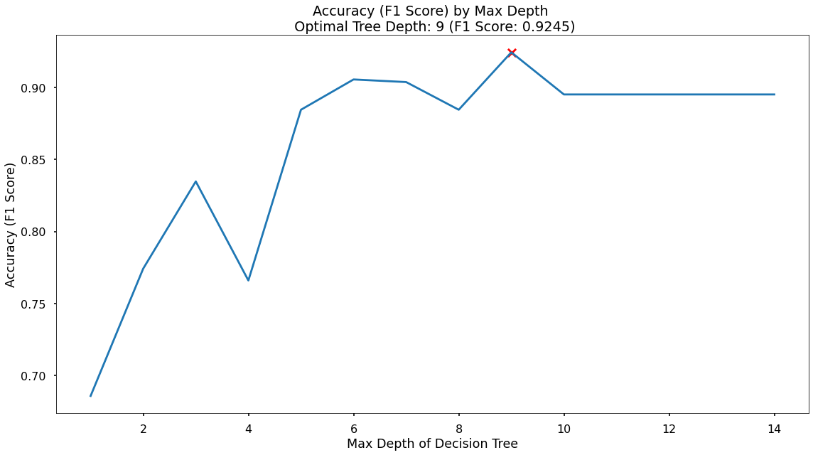
In the plot we can see that the maximum F1-Score on the test set is found when applying a max_depth value of 9 which takes our F1-Score up to 0.925
Random Forest
Data Import
# import required packages
import pandas as pd
import pickle
import matplotlib.pyplot as plt
import numpy as np
from sklearn.ensemble import RandomForestClassifier
from sklearn.utils import shuffle
from sklearn.model_selection import train_test_split, cross_val_score, KFold
from sklearn.metrics import confusion_matrix, accuracy_score, precision_score, recall_score, f1_score
from sklearn.preprocessing import OneHotEncoder
from sklearn.inspection import permutation_importance

# import modelling data
data_for_model = pickle.load(open("data/delivery_club_modelling.p", "rb"))

# drop uneccessary columns
data_for_model.drop("customer_id", axis = 1, inplace = True)

# shuffle data
data_for_model = shuffle(data_for_model, random_state = 42)
Data Preprocessing
While Linear Regression is susceptible to the effects of outliers, and highly correlated input variables - Random Forests, just like Decision Trees, are not.
Missing Values
# remove rows where values are missing
data_for_model.isna().sum()
data_for_model.dropna(how = "any", inplace = True)
Split Out Data For Modelling
# split data into X and y objects for modelling
X = data_for_model.drop(["signup_flag"], axis = 1)
y = data_for_model["signup_flag"]

# split out training & test sets
X_train, X_test, y_train, y_test = train_test_split(X, y, test_size = 0.2, random_state = 42, stratify = y)
Categorical Predictor Variables
See discussion in Logistic Regression, above…
# list of categorical variables that need encoding
categorical_vars = ["gender"]

# instantiate OHE class
one_hot_encoder = OneHotEncoder(sparse=False, drop = "first")

# apply OHE
X_train_encoded = one_hot_encoder.fit_transform(X_train[categorical_vars])
X_test_encoded = one_hot_encoder.transform(X_test[categorical_vars])

# extract feature names for encoded columns
encoder_feature_names = one_hot_encoder.get_feature_names_out(categorical_vars)

# turn objects back to pandas dataframe
X_train_encoded = pd.DataFrame(X_train_encoded, columns = encoder_feature_names)
X_train = pd.concat([X_train.reset_index(drop=True), X_train_encoded.reset_index(drop=True)], axis = 1)
X_train.drop(categorical_vars, axis = 1, inplace = True)

X_test_encoded = pd.DataFrame(X_test_encoded, columns = encoder_feature_names)
X_test = pd.concat([X_test.reset_index(drop=True), X_test_encoded.reset_index(drop=True)], axis = 1)
X_test.drop(categorical_vars, axis = 1, inplace = True)
Model Training
We can build more Decision Trees in the Random Forest (500) than would be done using the default value of 100. It may be worth testing the results of varying forest sizes.
Since the default scikit-learn implementation of Random Forests does not limit the number of randomly selected variables offered up for splitting at each split point in each Decision Tree - we put this in place using the max_features parameter. This can always be refined later through testing, or through an approach such as gridsearch.
# instantiate our model object
clf = RandomForestClassifier(random_state = 42, n_estimators = 500, max_features = 5)

# fit our model using our training & test sets
clf.fit(X_train, y_train)
Model Performance Assessment
Predict On The Test Set
In the code below we create one object to hold the binary 1/0 predictions, and another to hold the actual prediction probabilities for the positive class.
# predict on the test set
y_pred_class = clf.predict(X_test)
y_pred_prob = clf.predict_proba(X_test)[:,1]
Confusion Matrix
# create the confusion matrix
conf_matrix = confusion_matrix(y_test, y_pred_class)

# plot the confusion matrix
plt.style.use("seaborn-v0_8-poster")
plt.matshow(conf_matrix, cmap = "coolwarm")
plt.gca().xaxis.tick_bottom()
plt.title("Confusion Matrix")
plt.ylabel("Actual Class")
plt.xlabel("Predicted Class")
for (i, j), corr_value in np.ndenumerate(conf_matrix):
    plt.text(j, i, corr_value, ha = "center", va = "center", fontsize = 20)
plt.show()
Classification Performance Metrics
Accuracy, Precision, Recall, F1-Score
See discussion in Logistic Regression, above…
# classification accuracy
accuracy_score(y_test, y_pred_class)

# precision
precision_score(y_test, y_pred_class)

# recall
recall_score(y_test, y_pred_class)

# f1-score
f1_score(y_test, y_pred_class)
- Classification Accuracy = 0.935 meaning we correctly predicted the class of 93.5% of test set observations
- Precision = 0.887 meaning that for our predicted delivery club signups, we were correct 88.7% of the time
- Recall = 0.904 meaning that of all actual delivery club signups, we predicted correctly 90.4% of the time
- F1-Score = 0.895
These are all higher than the results from the Logistic Regression model, and marginally higher than those from the Decision Tree model. Because our primary concern here is predictive accuracy, this is the best model to predict our data on. If we were happier with a simpler, easier to explain model, but that had almost the same performance - then we would choose the Decision Tree instead.
Feature Importance
Because Random Forests are an ensemble of many Decision Trees, we end up with a powerful and robust model, but because of the random nature of all the trees in the forest - the model gives us a unique insight into how important each of our input variables are to the overall model.
So, in a Random Forest the importance of a feature is measured by asking How much would accuracy decrease if a specific input variable was removed or randomized? If this decrease in accuracy is large, then we’d deem that input variable to be quite important, and if there is only a small decrease in accuracy, then we’d conclude that the variable is of less importance.
There are a couple ways to go about this: Feature Importance, and Permutation Importance
Feature Importance is where we find all nodes in the Decision Trees of the forest where a particular input variable is used to split the data and assess what the accuracy scores (for a classification problem) were before the split was made, and compare this to the scores after the split was made. We can take the average of these improvements across all Decision Trees in the Random Forest to get a score that tells us how much better we’re making the model by using that input variable. If we do this for each of our input variables, we can compare these scores and understand which is adding the most value to the predictive power of the model!
Permutation Importance uses the data that has gone unused when the random samples are selected for each Decision Tree (each tree is “bootstrapped” from the training set, meaning it is sampled with replacement, so there will always be unused data in each tree. This unused data (i.e., not randomly selected) is known as Out of Bag observations and these can be used for testing the accuracy of each particular Decision Tree. For each Decision Tree, the Out of Bag observations are gathered and then passed through the same Tree models as if they were a second test set, and we can obtain an accuracy score. Then, in order to understand the importance of a feature, we randomize the values within one of the input variables - a process that essentially destroys any relationship that might exist between that input variable and the output variable - and run that updated data through the Decision Tree again, obtaining a second accuracy score. The difference between the original accuracy and the new accuracy gives us a view on how important that particular variable is for predicting the output.
Permutation Importance is often preferred over Feature Importance which can at times inflate the importance of numerical features. Both are useful, and in most cases will give fairly similar results.
Let’s put them both in place, and plot the results…
# calculate feature importance
feature_importance = pd.DataFrame(clf.feature_importances_)
feature_names = pd.DataFrame(X.columns)
feature_importance_summary = pd.concat([feature_names,feature_importance], axis = 1)
feature_importance_summary.columns = ["input_variable","feature_importance"]
feature_importance_summary.sort_values(by = "feature_importance", inplace = True)

# plot feature importance
plt.barh(feature_importance_summary["input_variable"],feature_importance_summary["feature_importance"])
plt.title("Feature Importance of Random Forest")
plt.xlabel("Feature Importance")
plt.tight_layout()
plt.show()

# calculate permutation importance
result = permutation_importance(clf, X_test, y_test, n_repeats = 10, random_state = 42)
permutation_importance = pd.DataFrame(result["importances_mean"])
feature_names = pd.DataFrame(X.columns)
permutation_importance_summary = pd.concat([feature_names,permutation_importance], axis = 1)
permutation_importance_summary.columns = ["input_variable","permutation_importance"]
permutation_importance_summary.sort_values(by = "permutation_importance", inplace = True)

# plot permutation importance
plt.barh(permutation_importance_summary["input_variable"],permutation_importance_summary["permutation_importance"])
plt.title("Permutation Importance of Random Forest")
plt.xlabel("Permutation Importance")
plt.tight_layout()
plt.show()
That code gives us the below plots - the first being for Feature Importance and the second for Permutation Importance!
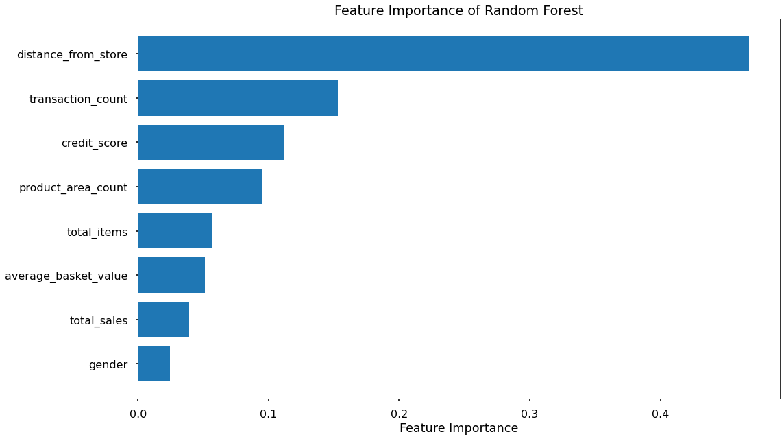
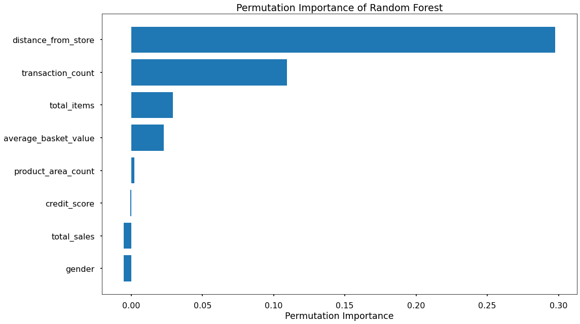
The overall story from both approaches is very similar, in that by far, the most important or impactful input variables are distance_from_store and transaction_count
There are slight differences in the order or “importance” for the remaining variables but overall they have provided similar findings.
___
K Nearest Neighbors
K nearest neighbors is a method of prediction where each datapoint is assessed for similar it is (or how close it is) to other data points.
Data Import
# import required packages
import pandas as pd
import pickle
import matplotlib.pyplot as plt
import numpy as np
from sklearn.neighbors import KNeighborsClassifier
from sklearn.utils import shuffle
from sklearn.model_selection import train_test_split, cross_val_score, KFold
from sklearn.metrics import confusion_matrix, accuracy_score, precision_score, recall_score, f1_score
from sklearn.preprocessing import OneHotEncoder, MinMaxScaler
from sklearn.feature_selection import RFECV

# import modelling data
data_for_model = pickle.load(open("data/delivery_club_modelling.p", "rb"))

# drop uneccessary columns
data_for_model.drop("customer_id", axis = 1, inplace = True)

# shuffle data
data_for_model = shuffle(data_for_model, random_state = 42)

# assess class balance of dependent variable
data_for_model["signup_flag"].value_counts(normalize = True)
Data Preprocessing
As a distance-based algorithm, KNN models are influenced by outliers, and they require scaled data. Other than this, the preprocessing steps are the same as the models above.
Missing Values
The number of missing values in the data was extremely low, so instead of applying any imputation (i.e. mean, most common value) we will just remove those rows
# remove rows where values are missing
data_for_model.isna().sum()
data_for_model.dropna(how = "any", inplace = True)
Outliers
As KNN models are affected by outliers, because when we scale the data, outliers cause remaining values to be bunched together - far from the outlier values, which may cause problems comparing them to the other input variables. Like in previous models, we can use the boxplot method to identify and remove outliers.
| metric | distance_from_store | credit_score | total_sales | total_items | transaction_count | product_area_count | average_basket_value |
|---|---|---|---|---|---|---|---|
| mean | 2.61 | 0.60 | 968.17 | 143.88 | 22.21 | 4.18 | 38.03 |
| std | 14.40 | 0.10 | 1073.65 | 125.34 | 11.72 | 0.92 | 24.24 |
| min | 0.00 | 0.26 | 2.09 | 1.00 | 1.00 | 1.00 | 2.09 |
| 25% | 0.73 | 0.53 | 383.94 | 77.00 | 16.00 | 4.00 | 21.73 |
| 50% | 1.64 | 0.59 | 691.64 | 123.00 | 23.00 | 4.00 | 31.07 |
| 75% | 2.92 | 0.67 | 1121.53 | 170.50 | 28.00 | 5.00 | 46.43 |
| max | 400.97 | 0.88 | 7372.06 | 910.00 | 75.00 | 5.00 | 141.05 |
outlier_investigation = data_for_model.describe()
outlier_columns = ["distance_from_store", "total_sales", "total_items"]

# boxplot approach
for column in outlier_columns:

    lower_quartile = data_for_model[column].quantile(0.25)
    upper_quartile = data_for_model[column].quantile(0.75)
    iqr = upper_quartile - lower_quartile
    iqr_extended = iqr * 2
    min_border = lower_quartile - iqr_extended
    max_border = upper_quartile + iqr_extended

    outliers = data_for_model[(data_for_model[column] < min_border) | (data_for_model[column] > max_border)].index
    print(f"{len(outliers)} outliers detected in column {column}")

    data_for_model.drop(outliers, inplace = True)
Split Out Data For Modelling
Same as in the previous models…
# split data into X and y objects for modelling
X = data_for_model.drop(["signup_flag"], axis = 1)
y = data_for_model["signup_flag"]

# split out training & test sets
X_train, X_test, y_train, y_test = train_test_split(X, y, test_size = 0.2, random_state = 42, stratify = y)
Categorical Predictor Variables
See the discussion in the Logistic Regression code, above.
# list of categorical variables that need encoding
categorical_vars = ["gender"]

# instantiate OHE class
one_hot_encoder = OneHotEncoder(sparse=False, drop = "first")

# apply OHE
X_train_encoded = one_hot_encoder.fit_transform(X_train[categorical_vars])
X_test_encoded = one_hot_encoder.transform(X_test[categorical_vars])

# extract feature names for encoded columns
encoder_feature_names = one_hot_encoder.get_feature_names_out(categorical_vars)

# turn objects back to pandas dataframe
X_train_encoded = pd.DataFrame(X_train_encoded, columns = encoder_feature_names)
X_train = pd.concat([X_train.reset_index(drop=True), X_train_encoded.reset_index(drop=True)], axis = 1)
X_train.drop(categorical_vars, axis = 1, inplace = True)

X_test_encoded = pd.DataFrame(X_test_encoded, columns = encoder_feature_names)
X_test = pd.concat([X_test.reset_index(drop=True), X_test_encoded.reset_index(drop=True)], axis = 1)
X_test.drop(categorical_vars, axis = 1, inplace = True)
Feature Scaling
In distance baseds algorithms in which the models compares values to similar or different data points across different dimensions in n-dimensional space, it is important to ensure that the variances for all variables are similar.
There are two common approaches for this, Standardization, and Normalization. Standardization rescales data to have a mean of 0, and a standard deviation of 1 - meaning most datapoints will most often fall between values of around -4 and +4. Normalization rescales datapoints so that they exist in a range between 0 and 1. Normalized data are less intuitive to interpret, but it is prefered here so that the scaled data will be compatible with any categorical variables that we have encoded as 1’s and 0’s.
# create our scaler object
scale_norm = MinMaxScaler()

# normalise the training set (using fit_transform)
X_train = pd.DataFrame(scale_norm.fit_transform(X_train), columns = X_train.columns)

# normalise the test set (using transform only)
X_test = pd.DataFrame(scale_norm.transform(X_test), columns = X_test.columns)
Feature Selection
As we discussed when applying Logistic Regression above - Recursive Feature Elimination With Cross Validation (RFECV) allows us to find the optimal number of input variables to model by finding the optimal accuracy scores over a number of model scenarios.
# instantiate RFECV & the model type to be utilised
from sklearn.ensemble import RandomForestClassifier
clf = RandomForestClassifier(random_state = 42)
feature_selector = RFECV(clf)

# fit RFECV onto our training & test data
fit = feature_selector.fit(X_train,y_train)

# extract & print the optimal number of features
optimal_feature_count = feature_selector.n_features_
print(f"Optimal number of features: {optimal_feature_count}")

# limit our training & test sets to only include the selected variables
X_train = X_train.loc[:, feature_selector.get_support()]
X_test = X_test.loc[:, feature_selector.get_support()]
We can then visualize these the cross-validated classification accuracy scores for each potential number of input variables.
plt.style.use("seaborn-v0_8-poster")
plt.plot(range(1, len(fit.cv_results_['mean_test_score']) + 1), fit.cv_results_['mean_test_score'], marker = "o")
plt.ylabel("Classification Accuracy")
plt.xlabel("Number of Features")
plt.title(f"Feature Selection using RFECV \n Optimal number of features is {optimal_feature_count} (at score of {round(max(fit.cv_results_['mean_test_score']),4)})")
plt.tight_layout()
plt.show()
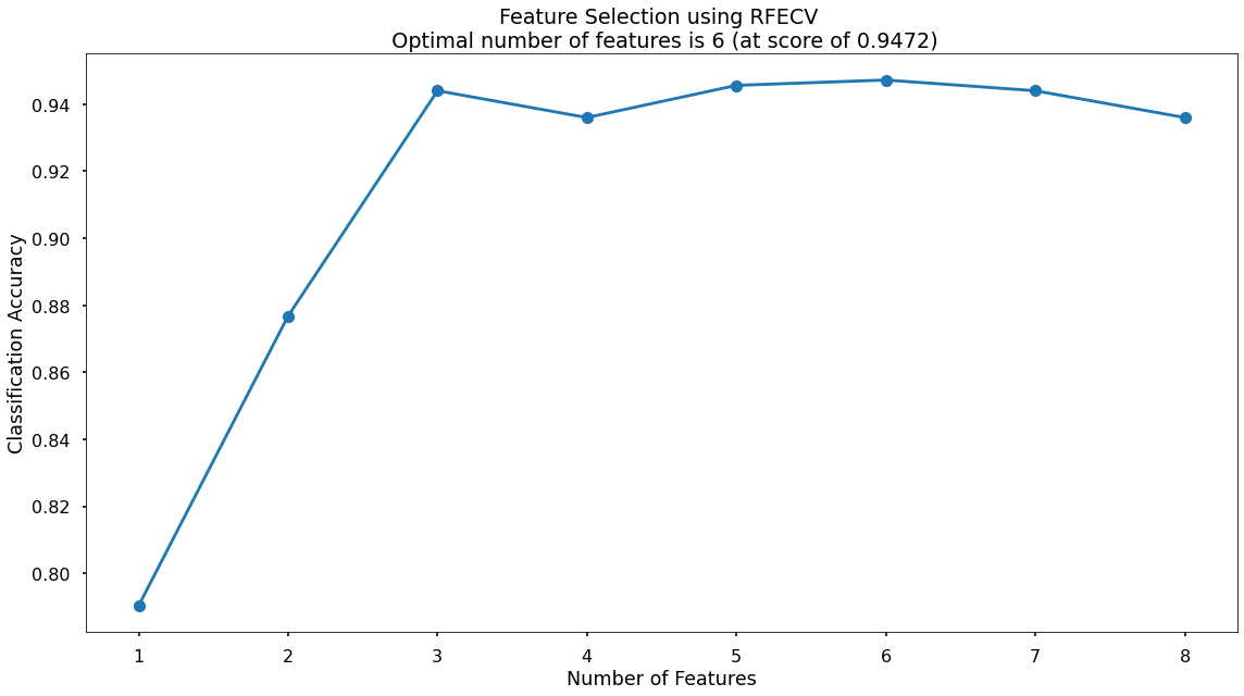
The highest cross-validated classification accuracy (0.9472) is when we include six of our original input variables - although there isn’t much difference in predictive performance between using three variables through to eight variables - and this syncs with what we saw in the Random Forest section above where only three of the input variables scored highly when assessing Feature Importance & Permutation Importance.
The variables that have been dropped are total_items and credit score - we will continue on with the remaining six!
Model Training
Instantiating and training our KNN model is done using the below code. At this stage we will just use the default parameters, meaning that the algorithm:
- Will use a value for k of 5, or in other words it will base classifications based upon the 5 nearest neighbors
- Will use uniform (default) weighting, or in other words an equal weighting to all 5 neighbors regardless of distance
# instantiate our model object
clf = KNeighborsClassifier()

# fit our model using our training & test sets
clf.fit(X_train, y_train)
Model Performance Assessment
Predict On The Test Set
# predict on the test set
y_pred_class = clf.predict(X_test)
y_pred_prob = clf.predict_proba(X_test)[:,1]
Confusion Matrix
# create the confusion matrix
conf_matrix = confusion_matrix(y_test, y_pred_class)

# plot the confusion matrix
plt.style.use("seaborn-v0_8-poster")
plt.matshow(conf_matrix, cmap = "coolwarm")
plt.gca().xaxis.tick_bottom()
plt.title("Confusion Matrix")
plt.ylabel("Actual Class")
plt.xlabel("Predicted Class")
for (i, j), corr_value in np.ndenumerate(conf_matrix):
    plt.text(j, i, corr_value, ha = "center", va = "center", fontsize = 20)
plt.show()
Classification Performance Metrics
Accuracy, Precision, Recall, F1-Score
For details on these performance metrics, please see the above section on Logistic Regression.
# classification accuracy
accuracy_score(y_test, y_pred_class)

# precision
precision_score(y_test, y_pred_class)

# recall
recall_score(y_test, y_pred_class)

# f1-score
f1_score(y_test, y_pred_class)
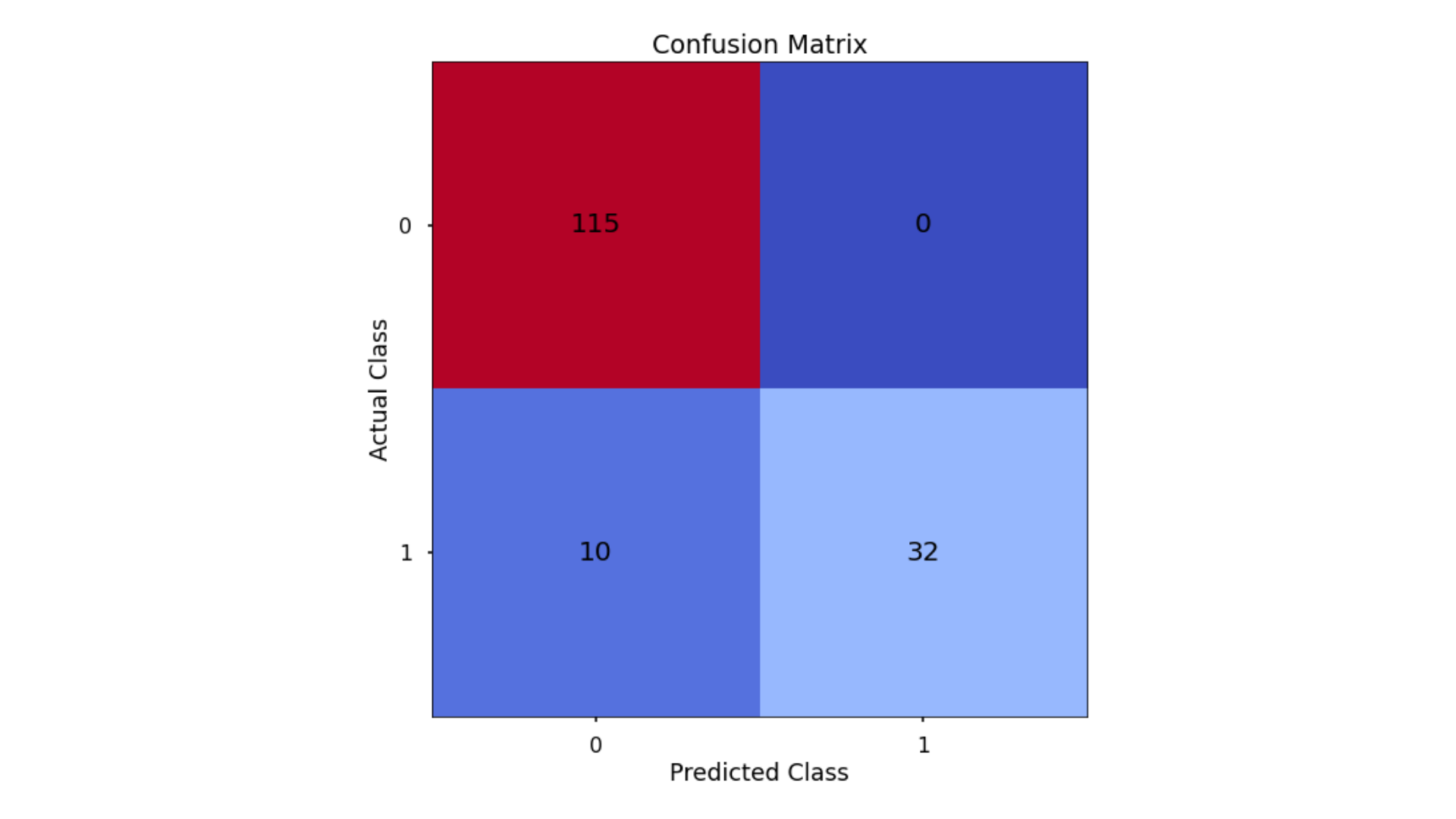
- Classification Accuracy = 0.936 meaning we correctly predicted the class of 93.6% of test set observations
- Precision = 1.00 meaning that for our predicted delivery club signups, we were correct 100% of the time
- Recall = 0.762 meaning that of all actual delivery club signups, we predicted correctly 76.2% of the time
- F1-Score = 0.865
The KNN has obtained the highest overall Classification Accuracy & Precision, but the lower Recall score has penalized the F1-Score meaning that is actually lower than what was seen for both the Decision Tree & the Random Forest!
Finding The Optimal Value For k
By default, the KNN algorithm within scikit-learn will use k = 5 meaning that classifications are based upon the five nearest neighbouring data-points in n-dimensional space.
Just because this is the default threshold does not mean it is the best one for our task.
Here, we will test many potential values for k, and plot the Precision, Recall & F1-Score, and find an optimal solution!
# set up range for search, and empty list to append accuracy scores to
k_list = list(range(2,25))
accuracy_scores = []

# loop through each possible value of k, train and validate model, append test set f1-score
for k in k_list:

    clf = KNeighborsClassifier(n_neighbors = k)
    clf.fit(X_train,y_train)
    y_pred = clf.predict(X_test)
    accuracy = f1_score(y_test,y_pred)
    accuracy_scores.append(accuracy)

# store max accuracy, and optimal k value
max_accuracy = max(accuracy_scores)
max_accuracy_idx = accuracy_scores.index(max_accuracy)
optimal_k_value = k_list[max_accuracy_idx]

# plot accuracy by max depth
plt.plot(k_list,accuracy_scores)
plt.scatter(optimal_k_value, max_accuracy, marker = "x", color = "red")
plt.title(f"Accuracy (F1 Score) by k \n Optimal Value for k: {optimal_k_value} (Accuracy: {round(max_accuracy,4)})")
plt.xlabel("k")
plt.ylabel("Accuracy (F1 Score)")
plt.tight_layout()
plt.show()
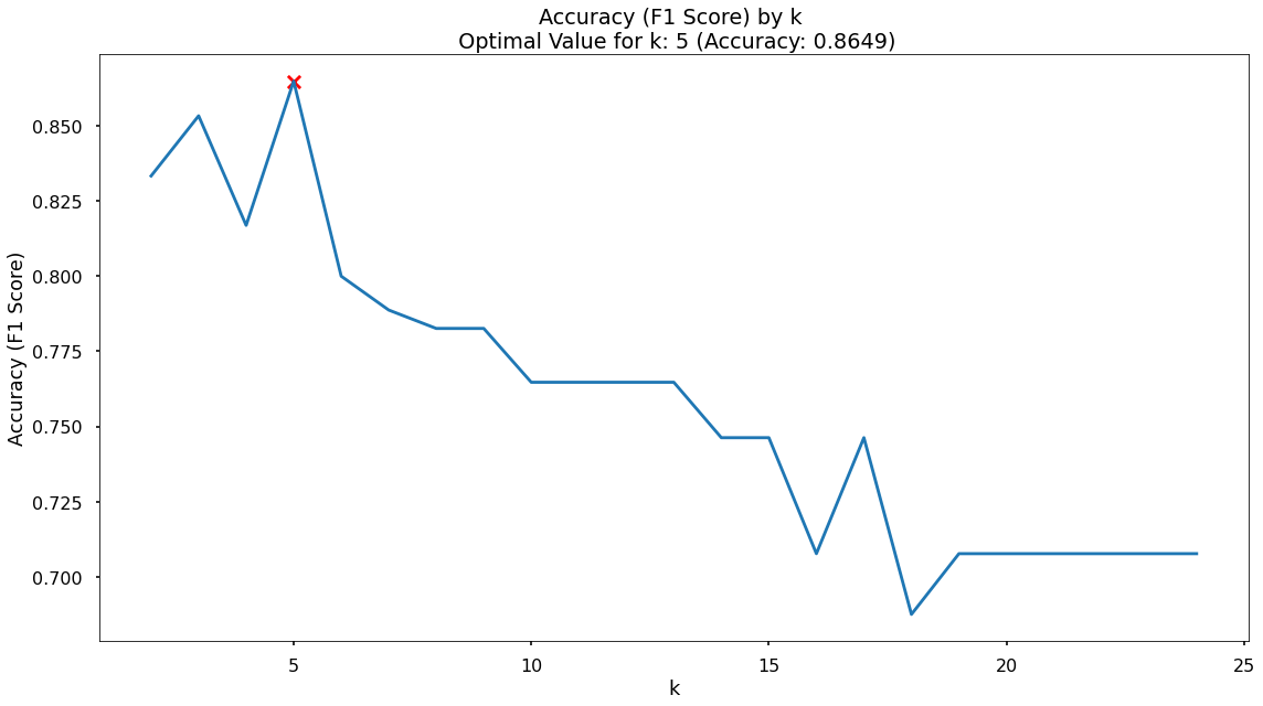
It turns out that the maximum F1-Score on the test set is found when applying a k value of 5 - which is exactly what we started with, so nothing needs to change.
Modelling Summary
The primary goal for the project was to build a model that would accurately predict the customers that would sign up for the delivery club. This would allow for a much more targeted approach when running the next iteration of the campaign. A secondary goal was to understand what the drivers for this are, so the client can get closer to the customers that need or want this service, and enhance their messaging.
Based upon these, the chosen the model is the Random Forest as it was a) the most consistent performer on the test set across classication accuracy, precision, recall, and f1-score, and b) the feature importance and permutation importance allows the client an understanding of the key drivers behind delivery club signups.
Metric 1: Classification Accuracy
- KNN = 0.936
- Random Forest = 0.935
- Decision Tree = 0.929
- Logistic Regression = 0.866
Metric 2: Precision
- KNN = 1.00
- Random Forest = 0.887
- Decision Tree = 0.885
- Logistic Regression = 0.784
Metric 3: Recall
- Random Forest = 0.904
- Decision Tree = 0.885
- KNN = 0.762
- Logistic Regression = 0.69
Metric 4: F1 Score
- Random Forest = 0.895
- Decision Tree = 0.885
- KNN = 0.865
- Logistic Regression = 0.734
Application
We now have a model object, and a the required pre-processing steps to use this model for the next delivery club campaign. When this is ready to launch we can aggregate the neccessary customer information and pass it through, obtaining predicted probabilities for each customer signing up.
Based upon this, we can work with the client to discuss where their budget can stretch to, and contact only the customers with a high propensity to join, thereby reducing marketing costs, and improving ROI.
Growth & Next Steps
While predictive accuracy was relatively high, other modelling approaches could be tested to see if even more accuracy could be gained.
From a data point of view, further data could be collected, and further feature engineering could be undertaken to ensure that we have as much useful information available for predicting delivery club sign up. For example, because distance from store appears to be the key driver of delivery club sign up (as well as customer loyalty… c.f., Predicting Customer Loyalty), it may make sense to collect more data on the geographic details of the business, specifically, where do customers live in relation to ABC vs. other stores?